Looking back at my journey as a digital designer,
I found one consistent theme. I have always preferred
the silly stuff! For this type project,
I wanted to
reflect the essence of what I
truly enjoy in design
(which is essentially anything that makes me laugh),
while staying true to a system that keeps the look
consistent and clean.
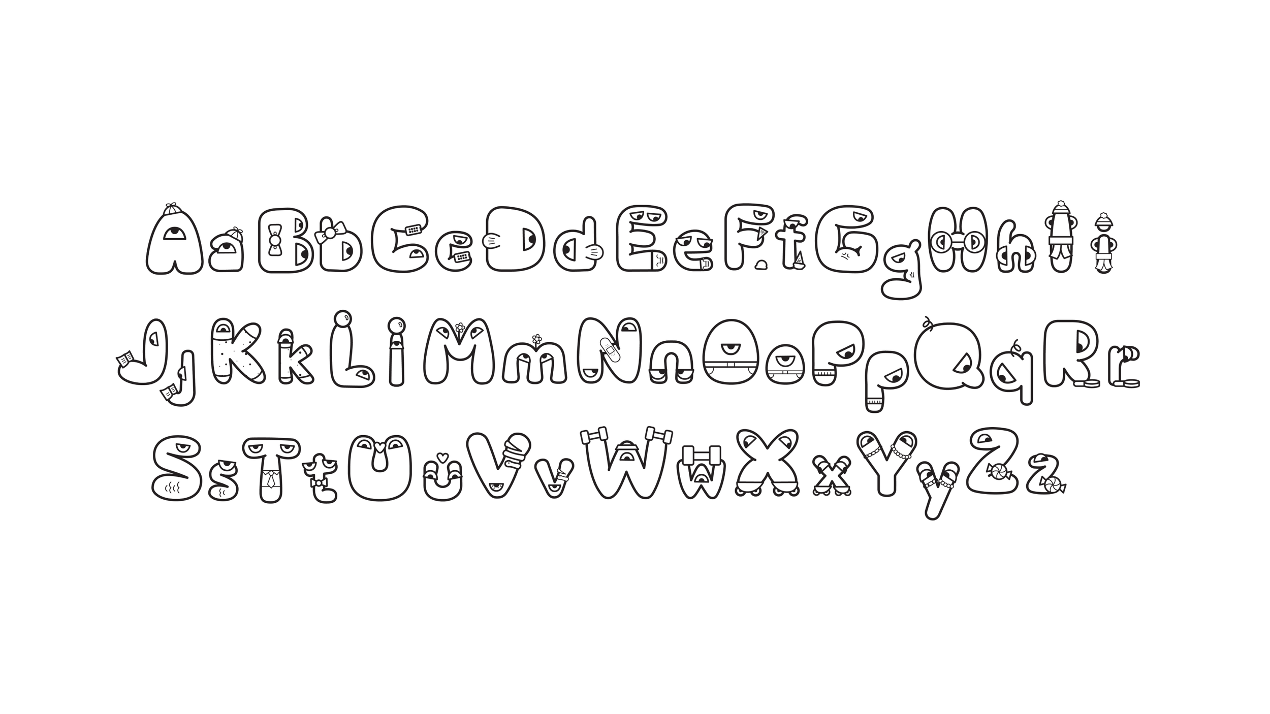


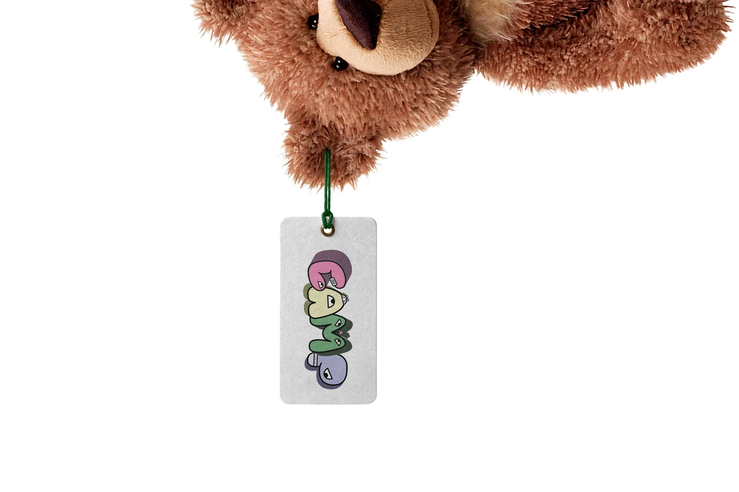
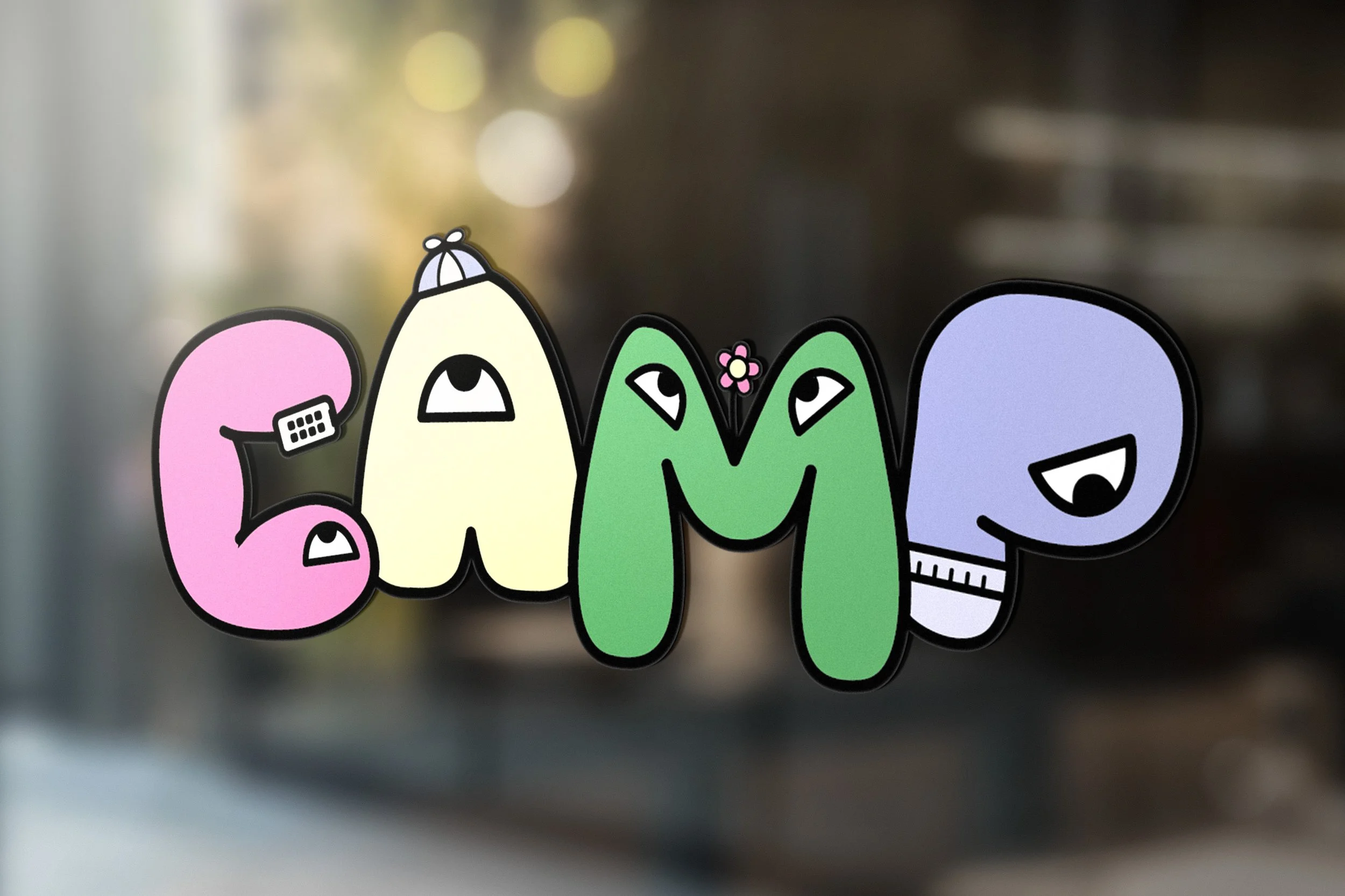
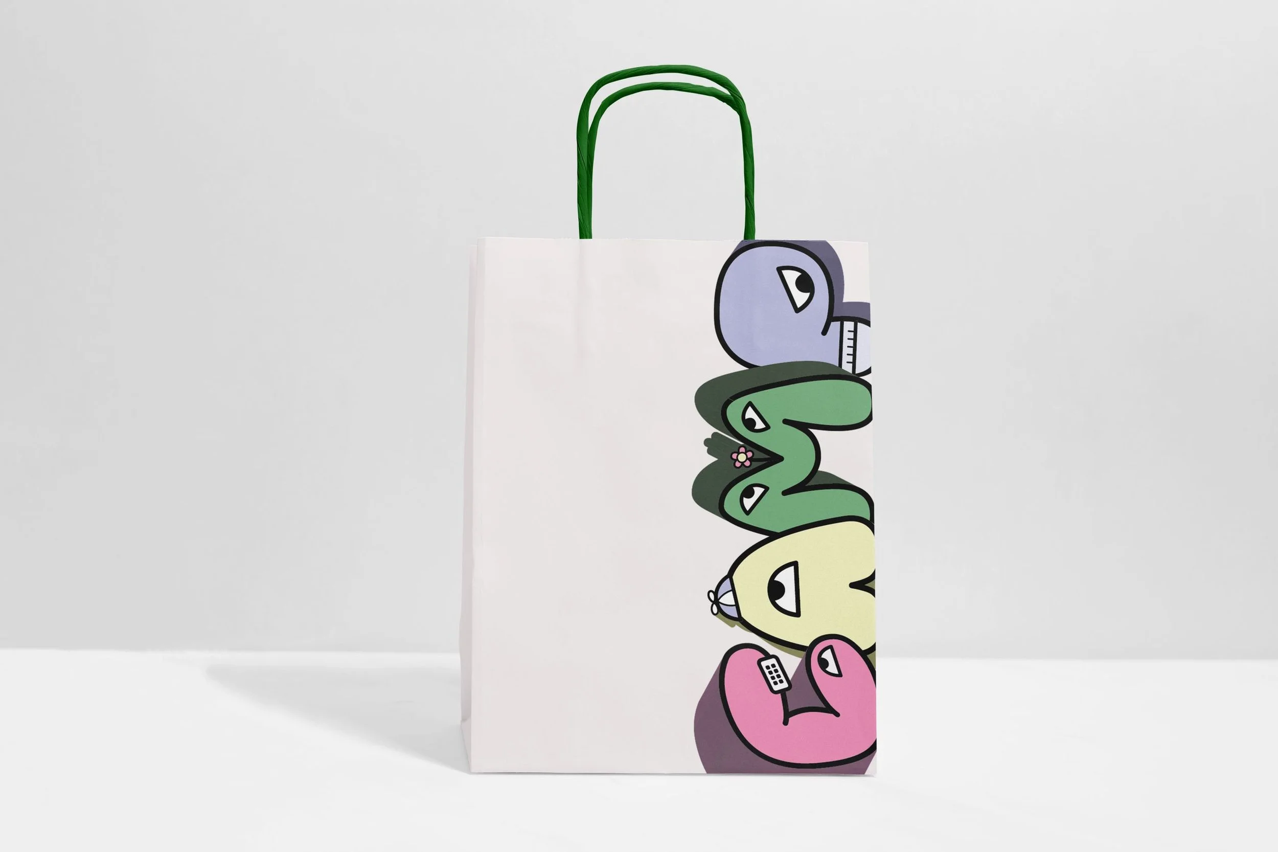
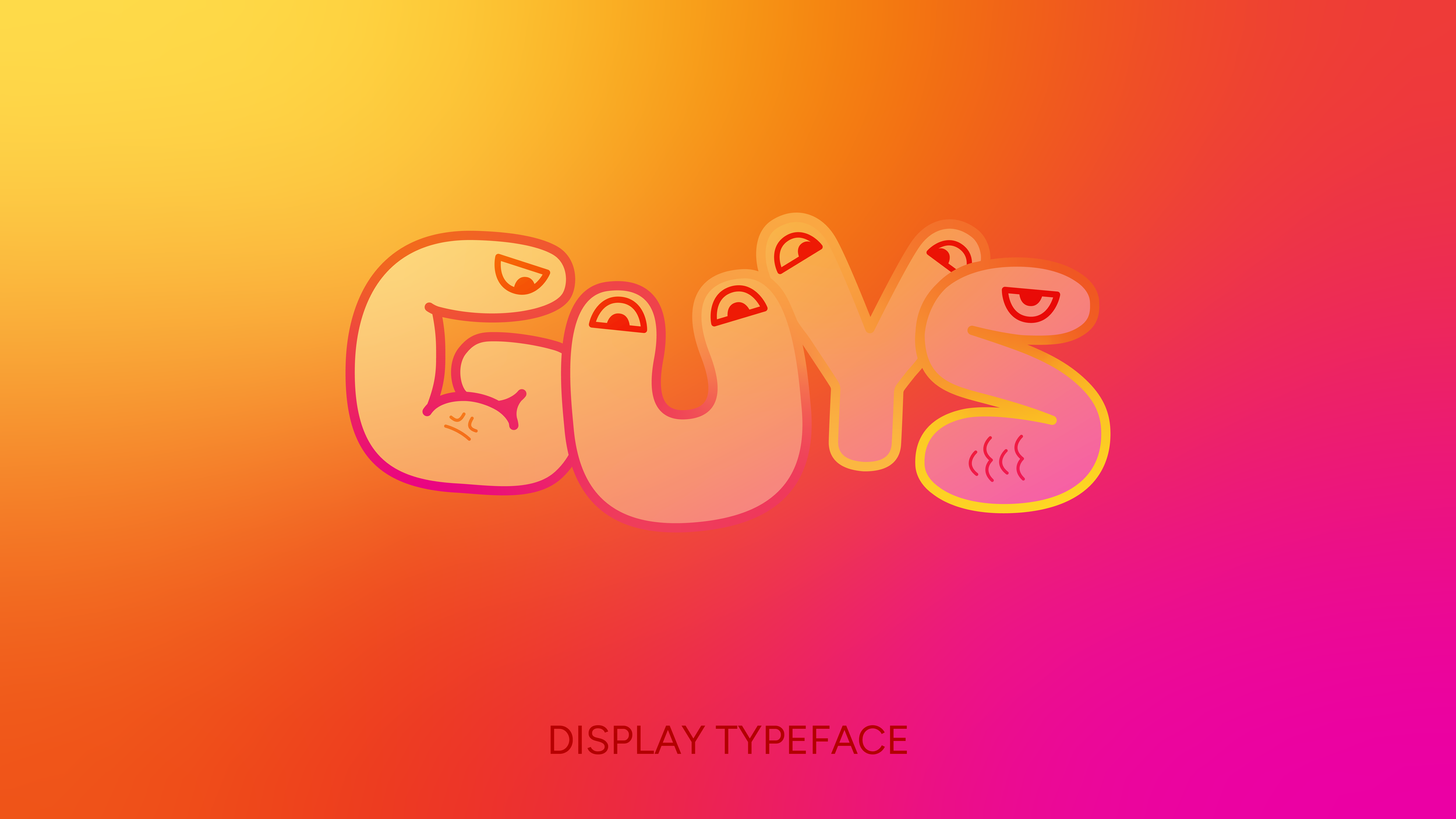
Although each character seems very silly and unique, there is still some structure to them. There are two options for eye sizing depending on the letter structure, and small indent in the corners of some letters to give a more bubbly look.